Brand
Visual identity for a real estate development: make it all look like one project
In short: A development's visual identity is the name, logo, colors, typography and image style that make all of its material recognizable as one project. When every piece looks like it came from a different development, buyers don't remember it and can't tell it apart from the competition.
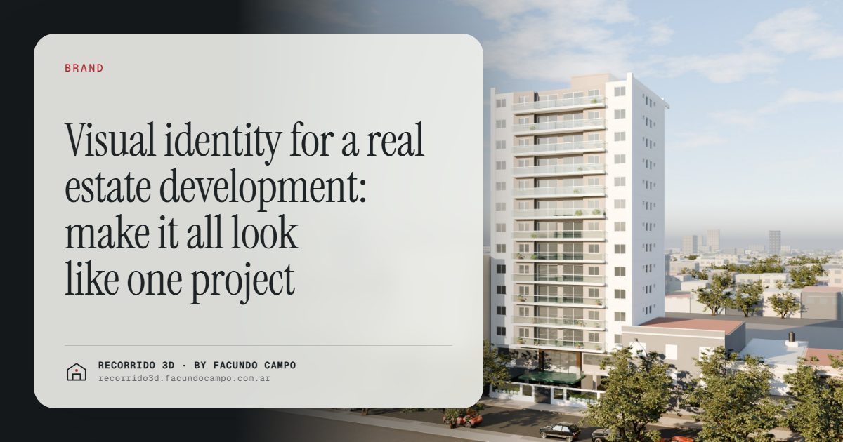
A real estate development's visual identity is the set of name, logo, colors, typography and image style that makes every piece of its material recognizable as one project. When the site sign, the website, the brochure and the Instagram posts all look like they belong together, buyers remember the development. When each piece looks different, they forget it, or mix it up with the building down the street.
Why does the identity fall apart on so many projects?
Usually not because someone made a bad decision, but because nobody made one. The logo came from a designer, the renderings from a studio, the website from an agency, the sign from a print shop and the social posts from whoever had time that week. Each one did a decent job on its own piece, and nobody looked at all of them side by side.
The result is familiar: the logo is blue on the sign and green on the website, the renderings show a warm sunset while the brochure is all cold daylight, the furniture in one image is minimalist and in another it's classic. None of it is wrong, but together it doesn't add up to a project.
What should repeat across every piece?
- Name and logo. With every version you'll need (horizontal, stacked, on light and dark backgrounds) so nobody has to improvise one.
- Color palette. Two or three main colors and one accent. Ideally related to the project itself: the brick of the facade, the wood of the windows, the green of the surroundings.
- Typography. One typeface for headlines and one for body text. Always the same ones.
- Image style. What light dominates, what kind of furniture, what weather, which people appear. This is what breaks most often and what buyers notice most.
- Tone of voice. If the development talks about "your first home" or "an investment in a growing neighborhood," it should say so everywhere.
Renderings are the most visible part of the identity
Logos and colors take up a corner of each piece. Renderings fill the rest: they're the hero image on the website, the face of the site sign, the first photo on listing sites. If they don't follow the identity, nothing else will hold it together. A few decisions to make up front:
- Time of day and light. If the project sells on natural light, the main renderings should be bright daytime. If it sells on its city views or evening life, add sunset or night renderings. What matters is that the choice is consistent. More in night and sunset renderings.
- Furniture style. It should match the buyer you're aiming at. A young family, an investor and an older couple look for different things, and the furniture speaks to each of them.
- Real surroundings. The building on its actual block, with its neighbors and its sidewalk. A rendering set in an invented landscape weakens the identity, because buyers don't recognize the place.
- The palette. If the brand has an accent color, it can show up subtly in the renderings: a cushion, a front door, the lobby signage.
The facade rendering deserves special care, because it's the image people will associate with the project's name for years.
Think about the buyer's whole journey
A buyer doesn't see your material in the order you made it. They might see an Instagram ad first, then the site sign while driving by, then the website, then a WhatsApp message from a salesperson with a link. Each touchpoint should confirm the previous one: "yes, this is the same building I saw."
That's where an interactive walkthrough fits well. If it carries the same name, colors and image style as everything else, it stops being a separate tool and becomes one more piece of the project. In the Americana 35.64 house demo, an unofficial working demo based on a model by Viviendas Roca, you can see how a house is presented with a consistent look from the floor plan to the finished rooms, in the browser and on a phone.
An identity that sets you apart
In areas with lots of new developments, buyers compare several projects at once, often on the same listing site and on the same afternoon. A clear, consistent identity is one of the few things that makes a project stick in memory after the browser tab is closed.
It doesn't need to be loud. It needs to be recognizable. A buyer who says "the one with the brick facade and the green logo" instead of "one of the ones on that avenue" already has your project in their head. There's more on this in how to differentiate a development when there's lots of supply.
Should every development have its own identity?
Generally, yes, within the developer's brand. Each project has its own buyer, its own location and its own personality, and its identity should reflect that. At the same time, a small, consistent signature from the developer (the company logo in the same place, a similar quality of image) lets buyers connect the dots between projects. That connection is how a developer builds a reputation over time, as I explain in building a developer's brand.
How to put it into practice
- Decide who you're selling to. Everything else follows from that.
- Lock the name, logo, colors and typography before ordering the rest of the material.
- Share that identity with everyone working on the project: rendering studio, web designer, printer and whoever runs social media.
- Order renderings with their final placement in mind: the wide sign, the website header and vertical formats for social.
- Review all the pieces together before launch, side by side.
If you're preparing a launch and want the renderings and walkthrough to match the rest of your project's identity, message me on WhatsApp at +54 9 11 6193-3176 or email facundocampo100@gmail.com. I work remotely from Buenos Aires (UTC−3) and answer in English and Spanish.
Frequently asked questions
What does a development's visual identity include?
The name, logo, color palette, typography, image style and tone of voice. Together they make every piece of material, from the site sign to the website, recognizable as the same project.
Should renderings follow the visual identity?
Yes. Renderings take up most of the space in almost every piece, so if their light, furniture and mood don't match the identity, the material won't feel like one project.
When should the visual identity be defined?
Before ordering renderings, the website or the site sign. Defining it afterward means redoing pieces or living with material that doesn't match.
Does a small development need a visual identity?
Yes, and it doesn't have to be complicated. A name, a simple logo, two colors and a consistent image style are enough to make a small project memorable.